By Ryan Kosai, Senior Engineer, ExtraHop Networks. Ryan's focus at ExtraHop is data analytics and machine learning.
Every business-type I've ever met loves buzzwords, and the term du jour is "big data." This is approximately the idea that when confronted with a giant pile of data, a computer can shake it and meaningful insights will fall out. Engineers, meanwhile, love the data for its own sake. But at a certain size, let's call it "one trillion," things start to get a little complicated.
If you can reduce this trillion into a smaller form, then you might have a better shot at finding insights in the data. But aggregation is, by its nature, a lossy procedure. How do you preserve the meaningful insights in your data, while making it manageable to access and query?
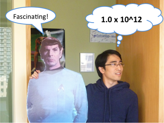
One Trillion: 1.0 x 10^12
One trillion of anything is a tremendous number, a magnitude that pushes the boundaries of comprehension. Working with data at this scale can be an extremely daunting prospect. Let's take a look at an example.We recently announced our EH8000 appliance, which is capable of analyzing over 400,000 HTTP transactions per second. For each of these transactions, we calculate and store the total time it took the server to respond to the transaction in milliseconds. At 400,000 transactions per second, we will have collected and stored one trillion transactions in just under a month.
Yes, that's one trillion transactions. Merely loading that much data in main memory (at several bytes per transaction) would take a coordinated approach across a cluster of machines. Doing any meaningful math on the data would require a significant investment of both time and money. Is there an easier way?
Finding the Central Tendency
The most common approach to reducing data to an understandable form is to take the arithmetic mean of the population (linear average). To get a sense of how the data changes over time, you can group the population into consecutive time intervals, with the mean calculated for each interval.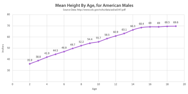
Example of aggregation using the arithmetic mean. The individual height surveys are consolidated on the basis of age.
With the mean, we seek to preserve the content and significance of the underlying data without storing every underlying transaction in the population. Of course, the mean is merely one function that attempts to accurately represent the central tendency: the way the population clusters around some primary value. There are many other estimators, some of which may be better at preserving the unique characteristics of the underlying data.
For example, an applicable estimator in some scenarios is the geometric mean, which is based on the product of the values instead of the sum. This aggregation is an excellent model for calculating change over time, especially when the underlying population is subject to a trend or shift. This is because while the value of an arithmetic mean is affected more by changes in large values than small values, the geometric mean only varies as a function of the percentage delta.
Robust Statistics
Unfortunately, many of these classical estimators fail to accurately describe the central tendency because they rely on assumptions about the underlying data that are not achieved in real-world scenarios. In these scenarios, a class of methods called "robust estimators" provides a better representation.The median (50th percentile value) is one such estimator that provides improved resistance to skewed distributions and outlying samples. Depending on the characteristics of the data, it often yields a more accurate aggregation of the underlying transactions.
One key failure of the median, however, is that it only represents the central value, without regard to the characteristics of the rest of the distribution. Several alternatives have been developed that seek to balance the robust characteristic of the median with the influence of the more extreme values. One elegant approach is Tukey's trimean, which is a weighted average of the 25th, 50th, and 75th percentile values.
The Winsorized mean combines advantages from both the median and the mean. It is calculated by replacing values in the population above the 95th percentile with the 95th percentile value, replacing any values below the 5th percentile with the 5th percentile value, and computing the arithmetic mean.
There are dozens of similarly popular estimators that seek to capture the essence of underlying data points into a single representative value. For brevity, the author shall not exhaustively enumerate them in this article.
Failure of the Central Tendency
All of the aforementioned estimators are intended to reduce populations to an approximation of their central tendency. This is an obvious and reasonable approach to unimodal distributions, but it is inaccurate when describing multimodal populations.As an example, consider a single web server backed by a cluster of three load-balanced database servers. One of the database nodes is having performance issues, and as a result, approximately one third of queries to the web server take 500ms to respond instead of 100ms. This creates a bimodal distribution, where there is no longer a single primary value that the population is clustered around.
Multimodal distributions are very common in production environments, where the complete set of transactions comprises a heterogeneous mix of service requests. Detecting and describing multimodality requires sophisticated statistics and is a topic of ongoing statistics research.
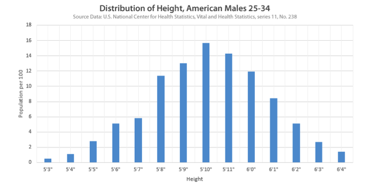
Thankfully, there is a less sophisticated, simpler method of encapsulating the distribution: the histogram.
Capturing the Distribution
The histogram is an aggregation designed to describe the distribution of data. While the data representation in a histogram is larger than a single aggregated value, the compression efficiency remains quite good.The representation is created by quantizing the population into discrete bins (representing a range of values) and storing the number of underlying transactions that fall into each bin range. The result is a frequency table that provides a compact representation of a population, while preserving the central tendency, outlying values, and any multimodal characteristics of the distribution.
For most people, it is visually presented in a familiar form:
An example histogram. Histograms also can be represented as a table of values and frequencies.
One further advantage of the histogram is that assuming a sufficient bin resolution, you can perform post-hoc computation of many statistical estimators. This is extremely advantageous because data can be efficiently encoded into histograms in real time and then be made available later for more sophisticated post-processing and analytics.
ExtraHop: Practicing the Art
As for the ExtraHop example, our implementation of the histogram is our dataset type, which is a high-resolution, sparsely populated version of the histogram. Due to its compact nature, we are able to aggregate and store the datasets at 30-second intervals. In this way, we effectively reduce one trillion transactions to 86,400 independent dataset instances.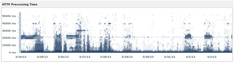
A map of HTTP processing time for requests on the ExtraHop corporate network. In this chart, March 30th and 31st were weekends.
For our users, this approach means we can faithfully reconstruct a meaningful visualization of their traffic, which captures both the central tendency and outlying values. The graph above is a density map of transaction processing time, where the darkest regions correspond to the highest number of transactions. Because we store datasets at 30-second intervals, you can see 10-day overviews such as this one, or zoom in and inspect minute-to-minute changes in the distribution.
We think this approach strikes a good balance, and hope you do as well. Leave a comment and let us know what you think.